

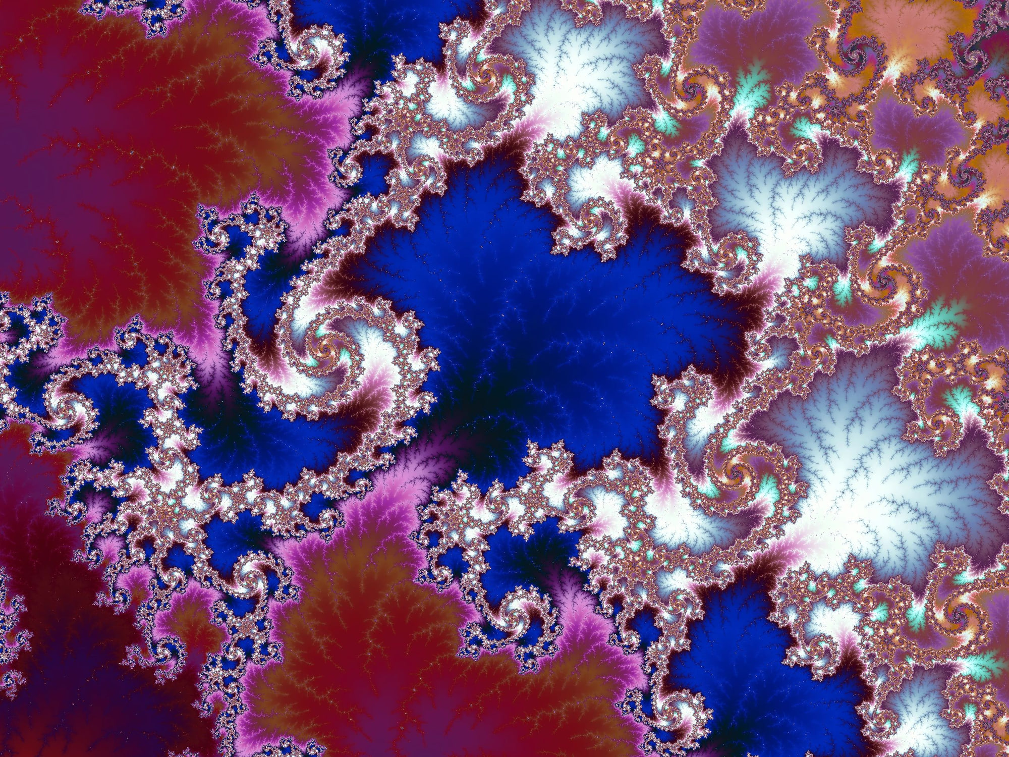
How Palettes Shape What You See — and How to Create Your Own
Introduction
One of the most surprising things new users discover is this:
The structure of a fractal doesn’t change — but what you see absolutely does.
Color is not decoration in fractal rendering. It is part of the data visualization itself. The same Mandelbrot coordinate, rendered with different palettes, can emphasize smooth structure, expose fine detail, or collapse into visual noise.
This post explains how palette design affects fractal images, why palette length matters at deep zoom, and how to create custom palettes in Mandelbrot Metal — both directly in the app and using the advanced photo2palette.swift command line (CLI) tool.
Color Is a Mapping, Not an Overlay
At its core, Mandelbrot coloring maps a numeric value (usually escape time or a smooth variant of it) to a color.
Two important consequences follow:
- Poor palettes hide detail
- Good palettes reveal structure that already exists
If a palette has abrupt transitions or too few color steps, small numerical differences collapse into visible banding. This becomes more pronounced as you zoom in, because neighboring pixels represent increasingly subtle numeric changes.
Why Palette Length Matters (Especially at Deep Zoom)
Short palettes work fine at shallow zooms, where iteration values change rapidly. At deep zoom, however:
- Iteration deltas between adjacent pixels become very small
- The same palette segment gets reused repeatedly
- Color banding becomes obvious
This is why Mandelbrot Metal includes Ultra-Wide palettes (768 steps). They allow smooth gradients to persist across many thousands of iterations without repeating patterns.
Rule of thumb:
- Shallow exploration → shorter palettes are fine
- Deep zoom → long, smooth palettes are essential
Continuous vs Discrete Coloring
Even with smoothing enabled, the palette itself can be:
- Discrete (distinct color blocks)
- Continuous (gradual interpolation)
Discrete palettes can be artistically effective, but they exaggerate banding at depth. Continuous palettes are better for structural exploration, especially when combined with long gradients.
This is why most of the included Ultra-Wide palettes favor smooth transitions over sharp stops.
"Color isn’t decoration. It’s how the mathematics becomes visible."
Creating Custom Palettes in Mandelbrot Metal (In-App)
For many users, the built-in Import Gradient feature is the fastest way to create a custom palette.
Using the Import Gradient Button
- Open Manage Palettes
- Tap Import Gradient
- Choose an image with a clear color progression (note: photos of skies, sunsets, water, or abstract images work well)
- Mandelbrot Metal samples the image horizontally and converts it into a palette
- The palette is saved immediately and can be used just like any built-in palette
Tips for Better Results
- Use images with smooth horizontal gradients
- Avoid high-contrast edges or textures
- Wider images produce better sampling
- Natural color transitions usually outperform synthetic ones
This method is ideal for experimentation and quick iteration.
Advanced Control: Creating Palettes with photo2palette.swift
For users who are comfortable working with the macOS terminal and want repeatability, precision, and batch control, Mandelbrot Metal includes the photo2palette.swift command-line tool. It's available to download on GitHub.
This tool converts images into palette JSON files with fine-grained control over sampling and output.
Why Use the CLI?
- Exact control over palette length (e.g., 64, 80, 256, 512, 768 steps)
- Consistent results across multiple source images
- Choose horizontal or vertical sampling
- Creates named JSON files that can be shared
- Scriptable workflows
- Ideal for artists building a palette library
Basic photo2palette Workflow
- Choose or create a source image
- Run photo2palette.swift with your desired parameters
- Generate a palette JSON file
- Import the JSON into Mandelbrot Metal
Example Use Case
- Extract a long, smooth gradient from a photograph
- Generate multiple variants at different lengths
- Test them at different zoom depths
- Keep only palettes that remain stable under extreme zoom
This workflow mirrors how many of the built-in Ultra-Wide palettes were created.
Learn more in the photo2palette readme.md.
Designing Palettes That Hold Up at Depth
When evaluating a palette, ask:
- Does it band at high iteration counts?
- Does it collapse into flat color regions?
- Does it emphasize structure or distract from it?
- Does it repeat too quickly?
A palette that looks great at 1× zoom may fail completely at deep zoom. Testing at multiple depths is essential.
Why Mandelbrot Metal Treats Palettes as First-Class Data
Many fractal apps treat color as an afterthought. Mandelbrot Metal treats palettes as part of the rendering pipeline, not decoration.
That’s why:
- Palettes are long
- Import/export is supported
- Naming and management matter
- Precision rendering is paired with precision color mapping
Color isn’t just style. It’s how the mathematics becomes visible.
Closing Thoughts
The Mandelbrot set is infinite, but what you perceive depends heavily on how you color it.
Learning to design and use palettes well doesn’t just make prettier images — it helps you see more of the structure that’s already there.
If you haven’t experimented with custom palettes yet, this is one of the highest-impact ways to deepen your exploration.
Learn more about the palette system
Fractal of the Week:
"Granite"
I love the subtle coloration in this fractal, which reminds me of natural granite stone.
Magnification: 5,347,843x
Iterations: 2,100
Palette: Car Show [UW]
3D Look: Off
👉 Get downloadable bookmarks you can import into Mandelbrot Metal on the Community Portal.