

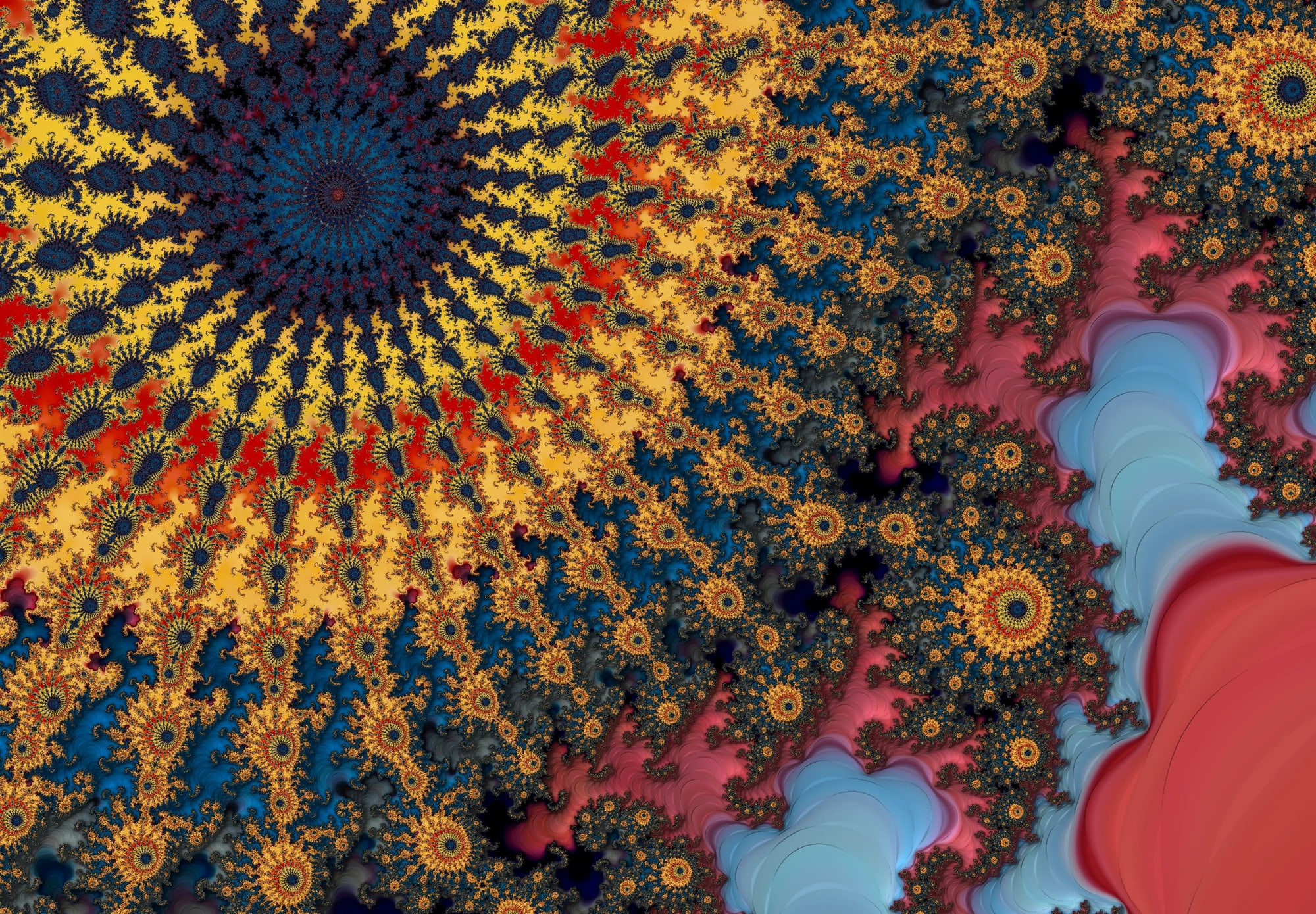
Inside Mandelbrot Metal’s Palette Engine
In fractal exploration, color is often treated as decoration — something applied after the math has done the “real work.”
In Mandelbrot Metal, color is part of the instrument.
A palette isn’t just a gradient. It’s a mapping between mathematical structure and visual meaning. Done well, it reveals detail, depth, and rhythm that would otherwise remain invisible. Done poorly, it hides structure, introduces noise, and flattens complexity.
This post is a look inside Mandelbrot Metal’s palette system — why it’s built the way it is, how it goes far beyond simple presets, and what becomes possible when color is treated as a first-class system rather than an afterthought.
Color Is Not Decoration
The Mandelbrot set is already visually rich before any color is applied. What color does is expose structure — gradients trace escape velocity, contours highlight topology, and subtle transitions reveal repetition that raw grayscale cannot.
That means color choices matter.
A low-resolution palette or a poorly constructed gradient can introduce banding, exaggerate noise, or mask fine detail. At deep zoom levels, these issues compound. What looks “fine” at shallow magnification often falls apart when pushed.
This is why Mandelbrot Metal doesn’t rely on a handful of simple gradients or sliders. Color needs the same care and engineering as the math itself.
What Makes a Palette Sophisticated
A serious palette system needs to handle more than just hue selection.
Some of the requirements:
- High resolution: hundreds of steps, not dozens
- Smooth perceptual transitions: avoiding visible banding
- Consistency across scales: palettes that work equally well at shallow and extreme zooms
- Intentional contrast control: revealing structure without overwhelming it
In Mandelbrot Metal, palettes are designed to remain stable as you zoom, pan, and iterate deeper. The goal is not just “nice colors,” but repeatable, controlled visual behavior.
The Mandelbrot Metal Palette Engine
At its core, the palette system is not a static list of presets. It’s a palette engine designed around experimentation, precision, and repeatability.
Palettes are:
- High-resolution (see technical details)
- Deterministic (the same math produces the same color output)
- Categorized and curated
- Designed to work with deep iteration counts and extreme zooms
This makes color predictable in the best way. When you adjust iterations, contrast, or zoom depth, you’re not fighting the palette — you’re working with it.
Palette Management for Real Exploration
As the palette library grew, management became as important as creation.
Mandelbrot Metal includes:
- A large, curated palette collection (currently 150+)
- Clear naming conventions
- Logical categories (Fire, Gem, Atmospheric, Metallic, Vivid, Ultra-Wide, and more)
- Duplicate handling that keeps experimentation organized instead of chaotic
The result is a workflow where you can move quickly, compare looks, and return to a palette later knowing exactly what it will do.
This matters when you’re exploring creatively — and even more when you’re trying to reproduce a specific result.
Importing Gradients: Bringing Your Own Color Language
One of the most powerful features in Mandelbrot Metal is the ability to import gradients.
This allows you to:
- Bring in gradients from design tools
- Reuse color schemes from other creative work
- Build palettes that reflect a personal or professional color language
Instead of adapting your work to the app, the app adapts to you.
This opens the door to consistency across projects — fractals that share a visual identity rather than relying on generic presets.
From Image to Palette: The CLI Tool
For users comfortable with the terminal and terminal commands, and who want to go even further, Mandelbrot Metal includes an advanced CLI tool, photo2palette, for generating palettes directly from images.
Example terminal command line for using photo2palette:
photo2palette --image glass.png --name "Glass" --steps 768 --format json > Glass.palette.json
This tool:
- Samples color data from an image
- Generates a high-resolution gradient, 768 steps wide in the above example
- Outputs a palette definition usable directly in the app
It’s designed for precision and repeatability. You can:
- Derive palettes from photographs, paintings, or renders
- Generate multiple variations
- Share palettes as data, not screenshots
Here is an illustration of what this command does:
At that point, Mandelbrot Metal becomes part of a creative pipeline rather than just a standalone app.
Get the tool and documentation here.
Sharing Palettes: Color as a Portable Asset
Once color is treated as a system, the next natural step is sharing.
In Mandelbrot Metal, palettes aren’t locked inside the app or reduced to screenshots. They’re portable assets — designed to be shared, reused, and built upon.
Palettes can be exported and imported in a structured format, which means:
- Colors are preserved exactly
- Gradients remain high-resolution
- Results are reproducible across devices and sessions
If someone else loads the same palette, they see the same colors — not an approximation.
From Personal Libraries to Shared Color Languages
This makes it possible to build:
- Personal palette libraries
- Project-specific color collections
- Shared visual languages across multiple fractals
You can explore with confidence, knowing that a palette you refine today will behave the same way tomorrow — or in someone else’s hands.
For artists, this enables consistency.
For technically minded users, it enables reproducibility.
For the community, it opens the door to collaboration.
Community and Exchange
Sharing palettes turns individual exploration into a conversation.
A palette isn’t just a set of colors — it’s a creative decision. When palettes are shared, users are effectively sharing how they see the Mandelbrot set, not just what region they explored.
This creates space for:
- Learning from each other’s color choices
- Discovering new visual styles
- Building on palettes created by others
Color becomes part of the dialogue, not just the output.
Designed for Growth
The palette system in Mandelbrot Metal was built with this future in mind. As the ecosystem grows — through sharing, importing, and community exchange — palettes remain first-class, structured, and intentional.
Because color isn’t an afterthought.
It’s something worth sharing properly.
Why This Matters
All of this exists for one reason: control.
Control over:
- how structure is revealed
- how detail emerges at depth
- how artistic intent is preserved across scales
- how results can be reproduced and shared
Whether you’re exploring the Mandelbrot set as mathematics, art, or both, color is not the final step. It’s part of the exploration itself.
Color as a First-Class System
Mandelbrot Metal treats color the same way it treats math and performance: as something worth engineering carefully.
A palette isn’t a finishing touch.
It’s part of the instrument.
Learn more about the palette system.
Fractal of the Week:
"Mini Brot Nebula"
This week’s featured fractal is a very deep zoom into a region with triple spirals. Deep within one such spiral lies a "mini Mandelbrot" with its familiar cardioid shape. This image was captured in Mandelbrot metal at a zoom of over 12.8 billion x, 16,000 iterations, and uses the Galaxy Quest [UW] ultra-wide palette.
👉 Get the Mandelbrot Metal bookmark to import this exact image and explore it on the Community Portal.